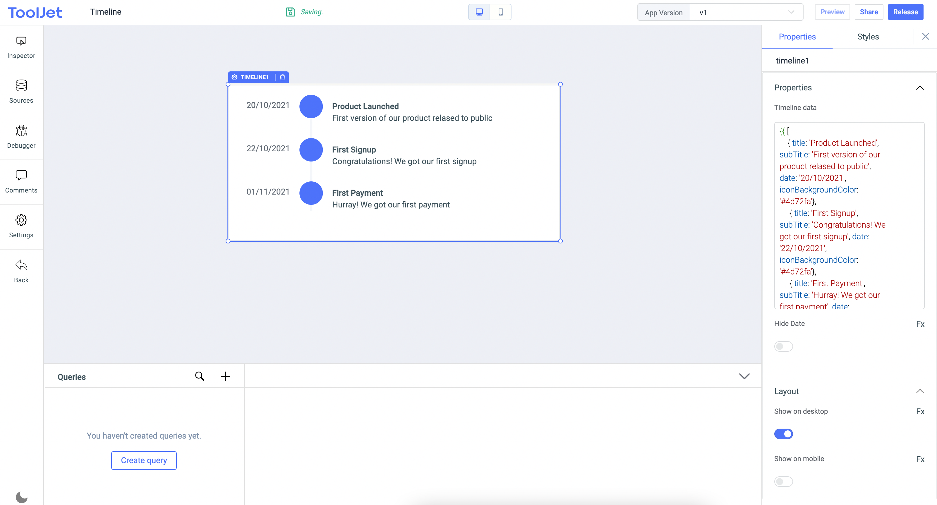
Timeline
Timeline widget can be used to do a visual representation of a sequence of events

Properties
Timeline data
Data requirements: The data needs to be an array of objects and each object should have title, subTitle, iconBackgroundColor and date keys.
Example:
[
    { "title": "Product Launched", "subTitle": "First version of our product released to public", "date": "20/10/2021", "iconBackgroundColor": "#4d72fa"},
    { "title": "First Signup", "subTitle": "Congratulations! We got our first signup", "date": "22/10/2021", "iconBackgroundColor": "#4d72fa"},
    { "title": "First Payment", "subTitle": "Hurray! We got our first payment", "date": "01/11/2021", "iconBackgroundColor": "#4d72fa"}
]
Hide date
Hide date can be used to hide the date time or Left Hand Side of the timeline widget
General
Tooltip
A Tooltip is often used to specify extra information about something when the user hovers the mouse pointer over the widget.
Under the General accordion, you can set the value in the string format. Now hovering over the widget will display the string as the tooltip.

Layout
| Layout | description | Expected value |
|---|---|---|
| Show on desktop | Toggle on or off to display desktop view. | You can programmatically determining the value by clicking on Fx to set the value {{true}} or {{false}} |
| Show on mobile | Toggle on or off to display mobile view. | You can programmatically determining the value by clicking on Fx to set the value {{true}} or {{false}} |
Styles
| Style | Description |
|---|---|
| Visibility | Toggle on or off to control the visibility of the widget. You can programmatically change its value by clicking on the Fx button next to it. If {{false}} the widget will not visible after the app is deployed. By default, it's set to {{true}}. |
信息
Any property having Fx button next to its field can be programmatically configured.