Circular Progress Bar
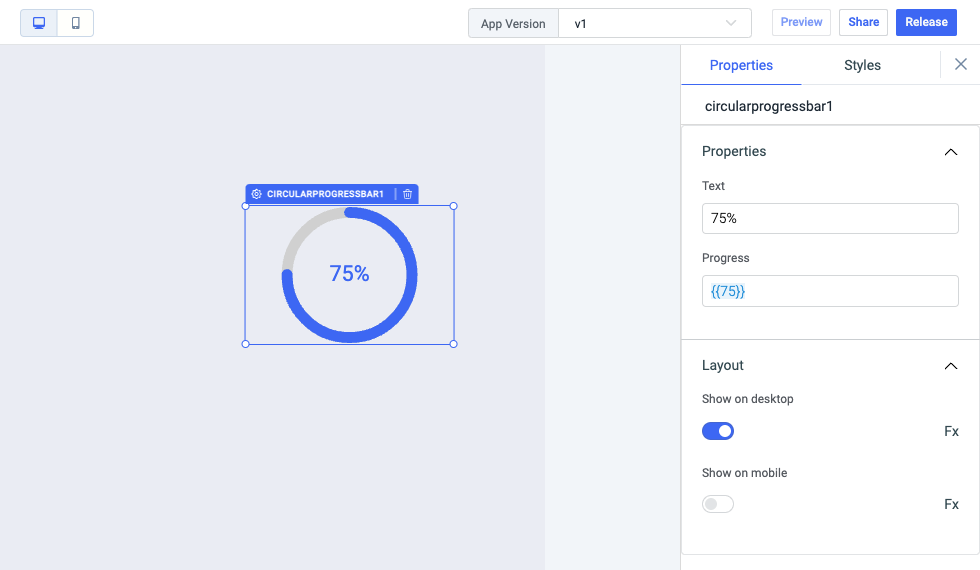
Circular progress bar widget can be used to show progress in a progress circle.

Properties
信息
Any property having Fx button next to its field can be programmatically configured.

| properties | description | Expected Value |
|---|---|---|
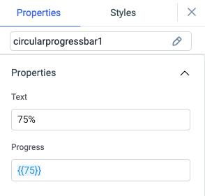
| Text | We can set a text inside the progress circle. | It expects a String, you can also use js to dynamically update the text as the progress changes. |
| Progress | It can be used to set the progress of the widget. | Progress should be an integer between 0 and 100. |
General
Tooltip
A Tooltip is often used to specify extra information about something when the user hovers the mouse pointer over the widget.
Under the General accordion, you can set the value in the string format. Now hovering over the widget will display the string as the tooltip.

Layout

| Layout | description |
|---|---|
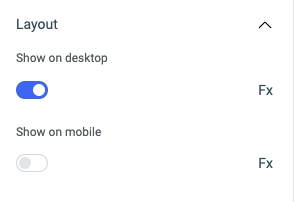
| Show on desktop | Toggle on or off to display the widget in desktop view. You can programmatically determine the value by clicking on Fx to set the value {{true}} or {{false}}. |
| Show on mobile | Toggle on or off to display the widget in mobile view. You can programmatically determine the value by clicking on Fx to set the value {{true}} or {{false}}. |
Styles

| properties | description | Expected Value |
|---|---|---|
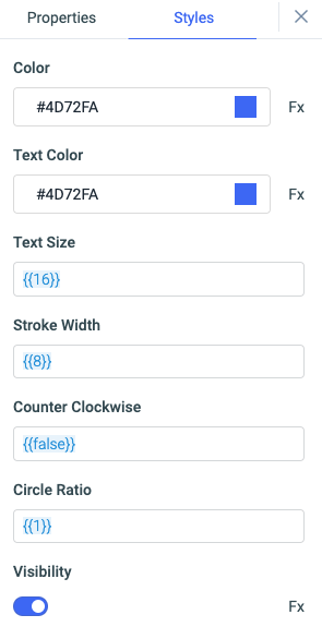
| Color | To define stroke color. | HEX color code or choose color from color-picker. |
| Text color | To define color of the text inside circular progress bar. | HEX color code or choose color from color-picker. |
| Text size | To define the size of the text | Value must between 0-100. |
| Stroke width | To define the width of stroke | Value must between 0-100. |
| Counter Clockwise | Whether to rotate progress bar in counterclockwise direction. | It accepts {{true}} and {{false}}, Default value is false. |
| Circle ratio | To define ratio of the full circle diameter the progressbar should use. | It accepts numerical value and the default is 1. |
| Visibility | Toggle on or off to control the visibility of the widget. | You can programmatically change its value by clicking on the Fx button next to it. If {{false}} the widget will not be visible after the app is deployed. By default, it's set to {{true}}. |
信息
Circular progress bar widget uses react-circular-progress package. Check the repo for further more details about properties and styles.