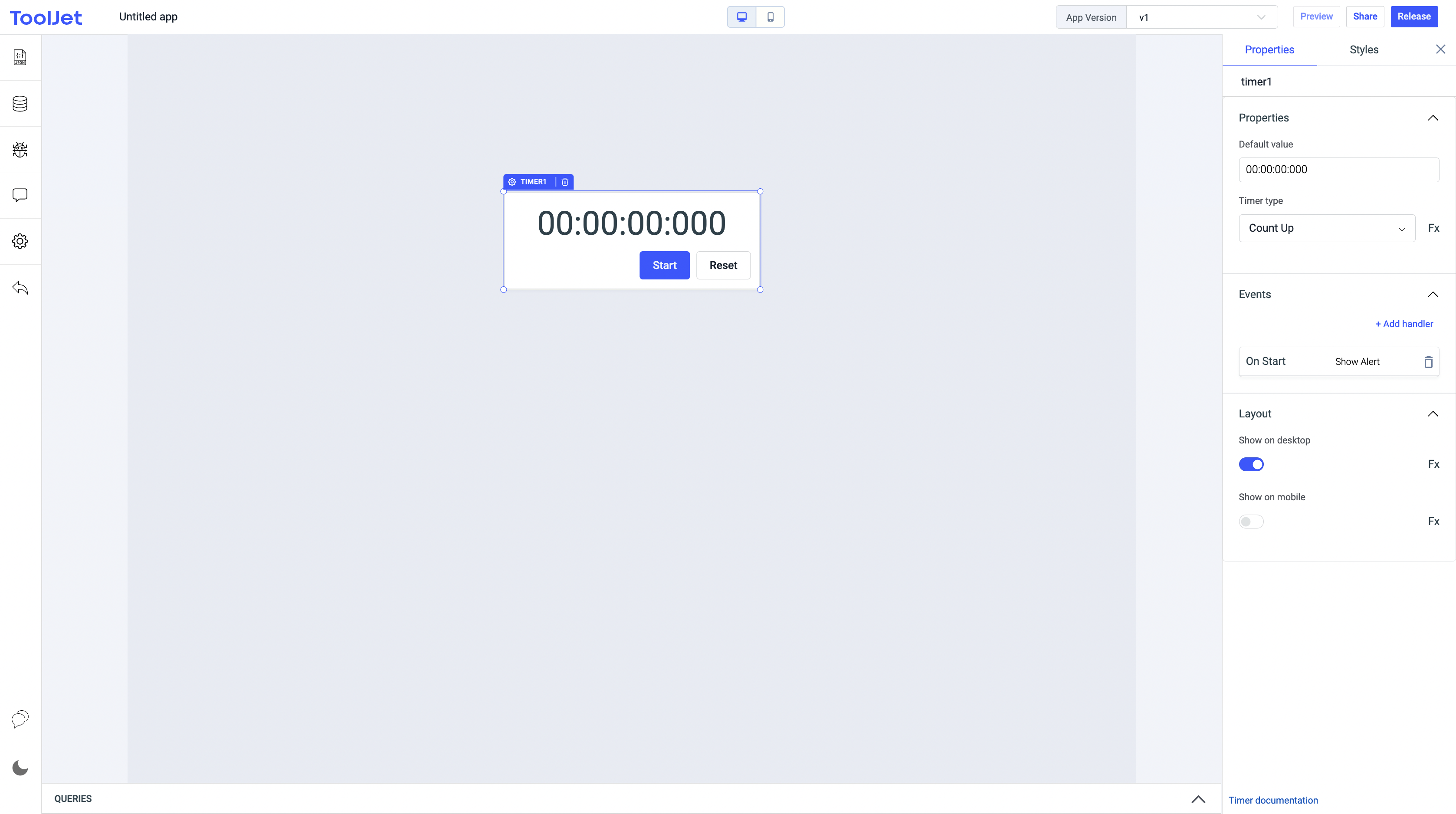
Timer
Timer widget lets users to count timer both upward and downward

Properties
Default value
It specifies the initial value of timer. Format is: HH.mm.ss.SS.
Timer type
It specifies If its a upward or downward counter. Select Count Up or Count Down from the dropdown or you can click on Fx to programmatically define the values countUp or countDown.
Events
On start
This event is fired when user clicks on start button.
On resume
This event is fired when user clicks on resume button.
On pause
This event is fired when user clicks on pause button.
On count down finish
This event is fired when the count down timer reaches zero.
On reset
This event is fired when user clicks on reset button.
Check Action Reference docs to get the detailed information about all the Actions.
General
Tooltip
A Tooltip is often used to specify extra information about something when the user hovers the mouse pointer over the widget.
Under the General accordion, you can set the value in the string format. Now hovering over the widget will display the string as the tooltip.

Layout
Show on desktop
Toggle on or off to display the widget in desktop view. You can programmatically determine the value by clicking on Fx to set the value {{true}} or {{false}.
Show on mobile
Toggle on or off to display the widget in mobile view. You can programmatically determine the value by clicking on Fx to set the value {{true}} or {{false}}.
Styles
Visibility
This is to control the visibility of the widget. If {{false}} the widget will not visible after the app is deployed. It can only have boolean values i.e. either {{true}} or {{false}}. By default, it's set to {{true}}.
Disable
This property only accepts boolean values. If set to {{true}}, the widget will be locked and becomes non-functional. By default, its value is set to {{false}}.
Any property having Fx button next to its field can be programmatically configured.