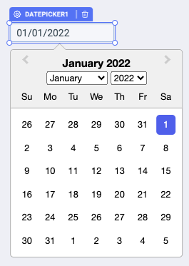
Datepicker
The Datepicker widget allows users to select a single value for date and time from a pre-determined set.

How To Use Datepicker Widget
Events
To add an event to a date-picker component, click on the widget handle to open the widget properties on the right sidebar. Go to the Events section and click on + Add handler.
On select
On select event is triggered when an date is selected.
Check Action Reference docs to get the detailed information about all the Actions.
Properties
Default value
This value acts as placeholder for the date picker widget, if any value is not provided then the default value will be used from the picker. The default value needs to be a String with respect to the format field. Ex: If format is set to MM/YYYY then provide default value as 04/2022.
Format
The format of the date selected by the date picker. Default date format is DD/MM/YYYY. Date format should be followed as ISO 8601 as mentioned in the moment documentation. This field requires a String input. Ex: DD/MM, MM/YYYY, YY/MM, DD/MM/YYYY etc.
Enable time selection?
Toggle on or off to enable the time selection. You can programmatically determine the value by clicking on Fx to set the value {{true}} or {{false}}.
Enable date selection?
Toggle on or off to enable the date selection. You can programmatically determine the value by clicking on Fx to set the value {{true}} or {{false}}.
Disabled dates
We can give disabled dates property which will make specific dates disabled and cannot be selected. The default value needs to be an array ofStrings.
Example for disabling the 9th of January:
{{['09-01']}}
Now user won't be able to select the mentioned date since it will be disabled.
Validation
Custom Validation
Add a validation for the date input in the widget using the ternary operator.
Example of validation for selecting dates that are after the current date:
{{moment(components.datepicker1.value, 'DD/MM/YYYY').isAfter(moment()) ? true : 'Date should be after today'}}
General
Tooltip
A Tooltip is often used to specify extra information about something when the user hovers the mouse pointer over the widget.
Under the General accordion, you can set the value in the string format. Now hovering over the widget will display the string as the tooltip.

Layout
Show on desktop
Toggle on or off to display the widget in desktop view. You can programmatically determine the value by clicking on Fx to set the value {{true}} or {{false}}.
Show on mobile
Toggle on or off to display the widget in mobile view. You can programmatically determine the value by clicking on Fx to set the value {{true}} or {{false}}.
Styles
Visibility
This is to control the visibility of the widget. If {{false}} the widget will not visible after the app is deployed. It can only have boolean values i.e. either {{true}} or {{false}}. By default, it's set to {{true}}.
Disable
This property only accepts boolean values. If set to {{true}}, the widget will be locked and becomes non-functional. By default, its value is set to {{false}}.
Border Radius
Use this property to modify the border radius of the date-picker. The field expects only numerical value from 1 to 100, default is 0.
Any property having Fx button next to its field can be programmatically configured.