Table
Tables can be used for both displaying and editing data.
Table data

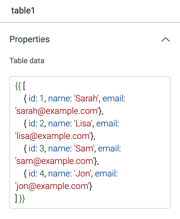
Array of objects to be displayed on the table. It is commonly used to display data from query ({{queries.restapi1.data}}). Table data expects an array of objects, example:
{{[{ id: 1, name: 'Sarah', email: 'sarah@example.com'}]}}
The table component will auto-generate all the columns as soon as the expected table data(array of objects) is provided.
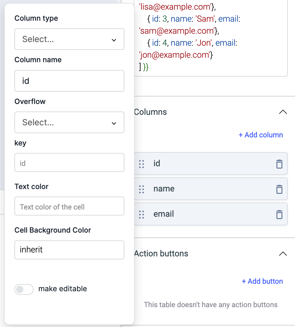
Columns

Cell data types
You can define the cell types as per your table's data source using the following:
- String | Default: It is used to render the data for cell types: text or textarea,
- Number: This cell type will only expect the numerical values and can be sorted in ascending or descending order
- Badge: It is a labeling component used to display data with badges for e.g status of a shipment
- Multiple badges: Similar to badge, used to display multiple data badges in the form of array of objects,
- Tags: Used to display an array of objects in the form of tags, e.g status, levels, steps
- Dropdown: When data is in the form of an array of options to be selected, e.g select priority
- Radio: Used to make a selection from a group of options, e.g select your salary-range
- Multiselect: Similar to dropdown but to collect multiple user inputs from a list of options,
- Toggle switch: Allows a user to change a setting between two states, e.g select between Yes/No,
- Date picker: Allowing users to display and select dates, e.g delivery date
- Image: This cell type expects the URL of image and will display the image in the cell. It also has the option to style the image.
Check this how-to guide on dynamically change the color of text in a row and column in the table.
Displaying Data
The data object should be an array of objects. Table columns can be added, removed, rearranged from the inspector. key property is the accessor key used to get data from a single element of a table data object. For example:
If the table data is:
[
    {
        "review": {
            "title": "An app review"
        },
    "user": {
            "name": "sam",
            "email": "sam@example.com"
        },
    }
]
To display email column, the key for the column should be user.email.
Saving data
Enable editable property of a column to make the cells editable. If a data type is not selected, string is selected as the data type.
If the data in a cell is changed, changeSet property of the table object will have the index of the row and the field that changed.
For example, if the name field of second row of example in the 'Displaying Data' section is changed, changeSet will look like this:
{
    2: {
        "name": "new name"
    }
}
Along with changeSet, dataUpdates property will also be changed when the value of a cell changes. dataUpdates will have the whole data of the changed index from the table data. dataUpdates will look like this for our example:
[{
    "review": {
        "title": "An app review"
    },
    "user": {
        "name": "new name",
        "email": "sam@example.com"
    },
}]
If the data of a cell is changed, "save changes" button will be shown at the bottom of the table. This button when clicked will trigger the Bulk update query event. This event can be used to run a query to update the data on your data source.
Validation
Under column properties, expand the detailed view of a column type to access a toggle button called make editable. You can toggle it ON to apply the validations for each column respectively using the following.
Regex
Use this field to enter a Regular Expression that will validate the password constraints.
Min length
Enter the number for a minimum length of password allowed.
Max length
Enter the number for the maximum length of password allowed.
Custom validation
If the condition is true, the validation passes, otherwise return a string that should be displayed as the error message. For example: {{components.passwordInput1.value === 'something' ? true: 'value should be something'}}
Action buttons

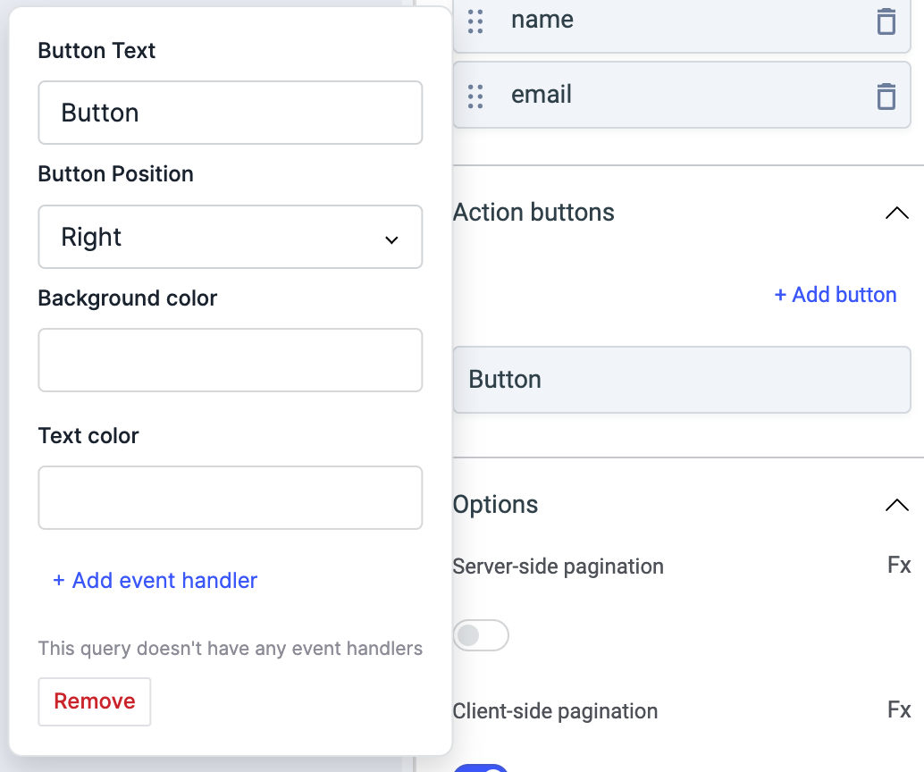
Action buttons will be displayed as the last column of the table. The styles of these buttons can be customised and on click actions can be configured. when clicked, selectedRow property of the table will have the table data of the row.
| Property | Description |
|---|---|
| Background color (Action Button) | Background color of the action button. |
| Text color (Action Button) | Color of button-text of the action button. |
Options
Any property having Fx button next to its field can be programmatically configured.
Server-side pagination
Server-side pagination can be used to run a query whenever the page is changed. Go to events section of the inspector and change the action for on page changed event. Number of records per page needs to be handled in your query. If server-side pagination is enabled, pageIndex property will be exposed on the table object, this property will have the current page index. pageIndex can be used to query the next set of results when page is changed.
When Server-side pagination is enabled, you'll be able to set three other table properties:
- Enable previous page button: When server-side pagination is enabled, this button is enabled by default. Toggle this off to hide the previous page button from the table.
- Enable next page button: When server-side pagination is enabled, this button is enabled by default. Toggle this off to hide the next page button from the table.
- Total records server side: Set a numerical value to display particular number of records.
Client-side pagination
Client-side pagination is enabled by default. When the client-side pagination is enabled({{true}}), another property Number of rows per page will be shown that can be used to set the number of records per page. By default, the value is set to 10 and if it is disabled({{false}}) then it will show all the records in the single page.
Server-side search
If server-side search is enabled, on search event is fired after the content of searchText property is changed. searchText can be used to run a specific query to search for the records in your data source.
Show download button
Show or hide download button at the Table footer.
Hide/Show columns
Table header has an option(Eye icon) to show/hide one or many columns on the table.
Show filter button
Show or hide filter button at the Table header. The following filters are available:
- contains
- does not contain
- matches
- does not match
- equals
- does not equal to
- is empty
- is not empty
- greater than
- greater than or equal to
- less than
- less than or equal to
Show update buttons
It's enabled by default. Table footer will show two update buttons Save changes & Discard changes whenever a cell is edited. Toggle off to hide update buttons.
Bulk selection
To let the user select one or more rows from the current page of a table, enable 'Bulk selection' from the inspector. The values of selected rows will be exposed as selectedRows.
Highlight selected row
Enable this option to have the last selected(clicked on) row to be highlighted.
Disable sorting
Enable this option to lock the sorting of columns when clicked on column name.
Server-side sort
When Server-side sort is enabled, clicking on the column headers will not automatically sort the table, instead, the Sort applied event will be fired and the applied sorting will be exposed as sortApplied. You can use this data to run any query that feeds data to the table in a manner that reflects the sorting applied.
Server-side filter
When Server-side filter is enabled, applying filters will not automatically filter the table, instead, the Filter changed event will be fired and the applied filters will be exposed as filters. You can use this data to run any query that feeds data to the table in a manner that reflects the filters applied.
Show search box
It can be used to show or hide Table Search box. Client-side search is enabled by default and server-side search can be enabled from the events section of the inspector. Whenever the search text is changed, the searchText property of the table component is updated. If server-side search is enabled, on search event is fired after the content of searchText property is changed. searchText can be used to run a specific query to search for the records in your data source.
If you don't wish to use the search feature altogether, you can disable it from the inspector.
Loading state (Boolean)
Loading state shows a loading skeleton for the table. This property can be used to show a loading status on the table while data is being loaded. isLoading property of a query can be used to get the status of a query.
Events
- Row hovered
- Row clicked
- Save changes
- Cancel changes
- Page changed
- Search
- Sort applied
- Cell value changed
- Filter changed
Row hovered
This event is triggered when the mouse pointer is moved over a row in the table. The hoveredRowId exposed variable of the table will include the id of the latest hovered row and hoveredRow property of the table will have the data of the hovered row in the object format.
Row clicked
This event is triggered when a table row is clicked. The selectedRowId exposed variable of the table will include the id of the selected row and the selectedRow property of the table object will have the table data of the selected row.
Save changes
If any cell of the table is edited, the save changes button appears at the footer of the table. Save changes event is triggered when this button is clicked.
Cancel changes
If any cell of the table is edited, the Discard changes button appears at the footer of the table. Cancel changes event is triggered when this button is clicked.
Page changed
If server-side pagination is enabled, this event is fired when the current page is changed. This event is triggered after updating the pageIndex variable.
Search
This event is triggered when a text is entered to the search input box of the table. searchText variable is updated before triggering this event.
Sort applied
This event is triggered when the column name header is clicked to apply sorting in asc or desc. The sortApplied variable is updated with an object having column and direction values.
Cell value changed
If any cell of the table is edited, the cell value changed event is triggered.
Filter changed
This event is triggered when filter is added, removed, or updated from the filter section of the table. filters property of the table is updated to reflect the status of filters applied. The objects will have properties: condition, value, and column.
Exposed variables
| variable | description |
|---|---|
| currentData | Data that is currently being displayed by the table ( including edits if any ) |
| currentPageData | Data that is displayed on the current page if pagination is enabled ( including edits if any ) |
| pageIndex | Index of the current page, starting from 1 |
| changeSet | Object with row number as the key and object of edited fields and their values as the value |
| dataUpdates | Just like changeSet but includes the data of the entire row |
| selectedRow | The data of the row that was last clicked. selectedRow also changes when an action button is clicked |
| searchText | The value of the search field if server-side pagination is enabled |
Styles
| Style | Description |
|---|---|
| Text color | Change the color of the text in table by providing hex color code or choosing one from the picker |
| Action button radius | This field can be used to give a radius to all action buttons. The default value is 0 |
| Table type | Select a type of table from the dropdown. |
| Cell size | This decides the size of table cells. You can choose between a Compact size for table cells or a Spacious size |
| Visibility | Toggle on or off to control the visibility of the widget. You can programmatically change its value by clicking on the Fx button next to it. If {{false}} the widget will not visible after the app is deployed. By default, it's set to {{true}}. |
| Disable | Toggle on to lock the widget. You can programmatically change its value by clicking on the Fx button next to it, if set to {{true}}, the widget will be locked and becomes non-functional. By default, its value is set to {{false}}. |
| Border radius | Use this property to modify the border radius of the button. |
Any property having Fx button next to its field can be programmatically configured.