Tags
Tags widget can be used to show array of data as tags.
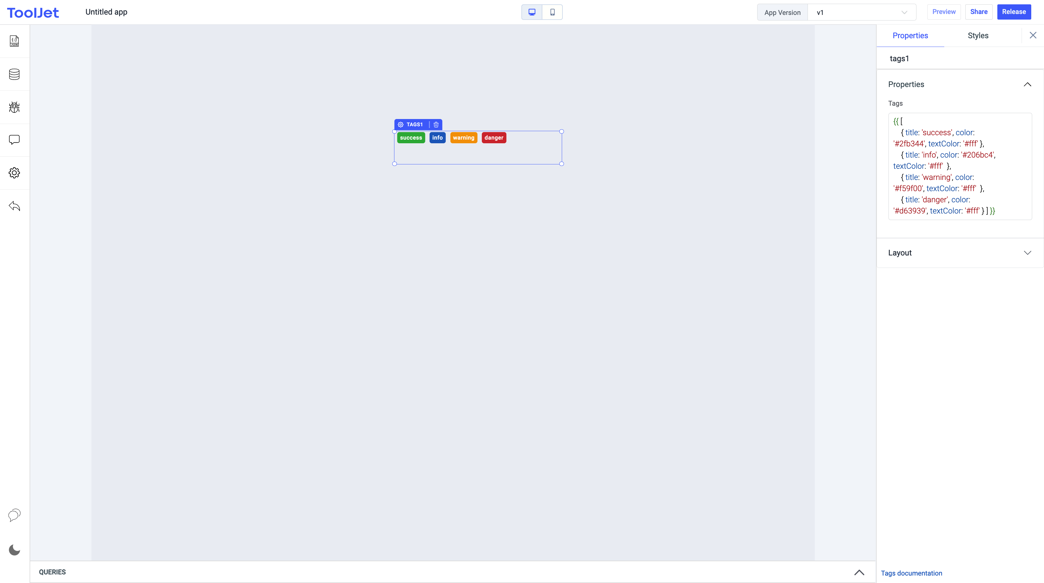
Properties
Tags
It can be used to set array of tags. It must be an array of objects like this:
{{
    [
        { title: 'success', color: '#2fb344', textColor: '#fff' },
        { title: 'info', color: '#206bc4', textColor: '#fff'  },
        { title: 'warning', color: '#f59f00', textColor: '#fff'  },
        { title: 'danger', color: '#d63939', textColor: '#fff' }
    ]
}}
Each object should contain a title, color code of a particular tag, and also a text color.
General
Tooltip
A Tooltip is often used to specify extra information about something when the user hovers the mouse pointer over the widget.
Under the General accordion, you can set the value in the string format. Now hovering over the widget will display the string as the tooltip.
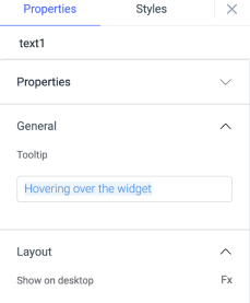
Layout
Show on desktop
Toggle on or off to display the widget in desktop view. You can programmatically determine the value by clicking on Fx to set the value {{true}} or {{false}}.
Show on mobile
Toggle on or off to display the widget in mobile view. You can programmatically determine the value by clicking on Fx to set the value {{true}} or {{false}}.
Styles
Visibility
Toggle on or off to control the visibility of the widget. You can programmatically change its value by clicking on the Fx button next to it. If {{false}} the widget will not be visible after the app is deployed. By default, it's set to {{true}}.