Filepicker
Filepicker widget allows the user to drag and drop files or upload files by browsing the filesystem and selecting one or more files in a directory.

File types must be a valid MIME type according to input element specification or a valid file extension.
To accept any/all file type(s), set Accept file types to an empty value.
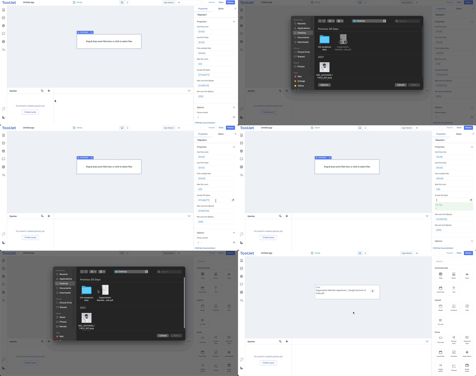
MIME type determination is not reliable across platforms. CSV files, for example, are reported as text/plain under macOS but as application/vnd.ms-excel under Windows.
Events
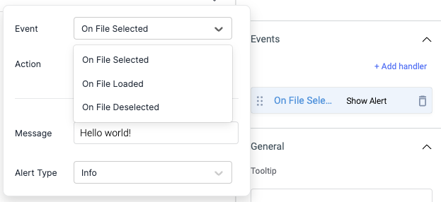
On file selected
On file selected event is triggered when one or more files are selected by the selector dialogue box.
On file loaded
On file loaded event is triggered when a file is loaded in the browser.
On file deselected
On file selected event can be triggered when one or more files are removed from the picker.
Check Action Reference docs to get the detailed information about all the Actions.
Properties
Instruction Text
Instruction text can be set to give information on the file picker.
Use Drop zone
Creates a drag & drop zone. Files can be dragged and dropped to the "drag & drop" zone.
Use File Picker
On clicking it invokes the default OS file prompt.
Pick multiple files
Allows drag and drop (or selection from the file dialog) of multiple files. Pick multiple files is disabled by default.
Max file count
The maximum accepted number of files The default value is 2.
Accept file types
By providing types, you can make the dropzone accept specific file types and reject the others.
Max size limit
Maximum file size (in bytes).
Min size limit
Minimum file size (in bytes).
Files can be accepted or rejected based on the file types, maximum file count, maximum file size (in bytes) and minimum file size (in bytes).
If Pick multiple files is set to false and additional files are dropped, all files besides the first will be rejected.
Any file that does not have a size in the range of Max size limit and Min size limit will be rejected.
Options
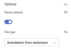
Parse content
Parse the selected files, supports CSV, xls, and xlsx files.
File type
If Parse content is enabled, options to auto-detect files and parse content or parse selected file types.
- If Parse content option is toggled off, File Type option will not be available.
- If the Parse content option is toggled on, it only parses the next file that is selected, not the already selected one.
General
Tooltip
A Tooltip is often used to specify extra information about something when the user hovers the mouse pointer over the widget.
Under the General accordion, you can set the value in the string format. Now hovering over the widget will display the string as the tooltip.

Layout
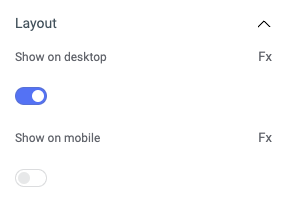
Show on desktop
Toggle on or off to display the widget in desktop view. You can programmatically determine the value by clicking on Fx to set the value {{true}} or {{false}}.
Show on mobile
Toggle on or off to display the widget in mobile view. You can programmatically determine the value by clicking on Fx to set the value {{true}} or {{false}}.
Styles
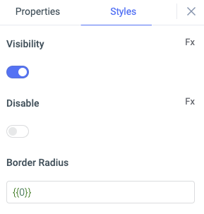
Visibility
This is to control the visibility of the widget. If {{false}} the widget will not visible after the app is deployed. It can only have boolean values i.e. either {{true}} or {{false}}. By default, it's set to {{true}}.
Disable
This property only accepts boolean values. If set to {{true}}, the widget will be locked and becomes non-functional. By default, its value is set to {{false}}.
Border Radius
Use this property to modify the border radius of the filepicker widget. The field expects only numerical value from 1 to 100, default is 0.
Any property having Fx button next to its field can be programmatically configured.
Actions
| Action | Description | Properties |
|---|---|---|
clearFiles() | It will clear the selected files | None |