Number Input
Number Input widget lets users enter and change numbers.
How To Use Number Input Widget
Numbers can be changed by using the arrow keys.
Properties
Default value
A predefined value that can be fetched from the number input widget if no changes are made in widget.
Minimum value
It specifies the minimum value the number input can go to. This field accepts any numerical value.
Maximum value
It specifies the maximum value the number input can go to. This field accepts any numerical value.
Placeholder
It specifies a hint that describes the expected value. This field accepts any numerical value.
Events
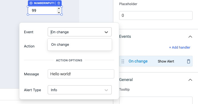
On change
This event fires whenever the value of the number input widget is changed.
Check Action Reference docs to get the detailed information about all the Actions.
General
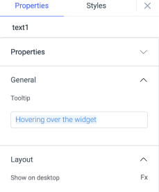
Tooltip
A Tooltip is often used to specify extra information about something when the user hovers the mouse pointer over the widget. Under the General accordion, you can set the value in the string format. Now hovering over the widget will display the string as the tooltip.
Layout
Show on desktop
Toggle on or off to display the widget in desktop view. You can programmatically determine the value by clicking on Fx to set the value {{true}} or {{false}}.
Show on mobile
Toggle on or off to display the widget in mobile view. You can programmatically determine the value by clicking on Fx to set the value {{true}} or {{false}}.
Styles
Visibility
Toggle on or off to control the visibility of the widget. You can programmatically change its value by clicking on the Fx button next to it. If {{false}} the widget will not be visible after the app is deployed. By default, it's set to {{true}}.
Disable
This is off by default, toggle on the switch to lock the widget and make it non-functional. You can also programmatically set the value by clicking on the Fx button next to it. If set to {{true}}, the widget will be locked and becomes non-functional. By default, its value is set to {{false}}.
Border radius
Add a border radius to the number input widget using this property. It accepts any numerical value from 0 to 100.
Border color
Change the border color number-input component by entering the Hex color code or choosing a color of your choice from the color picker.
Background color
Change the background color of the number-input component by entering the Hex color code or choosing a color of your choice from the color picker.
Text color
Change the color of the number in number-input component by entering the Hex color code or choosing a color of your choice from the color picker.
Any property having Fx button next to its field can be programmatically configured.