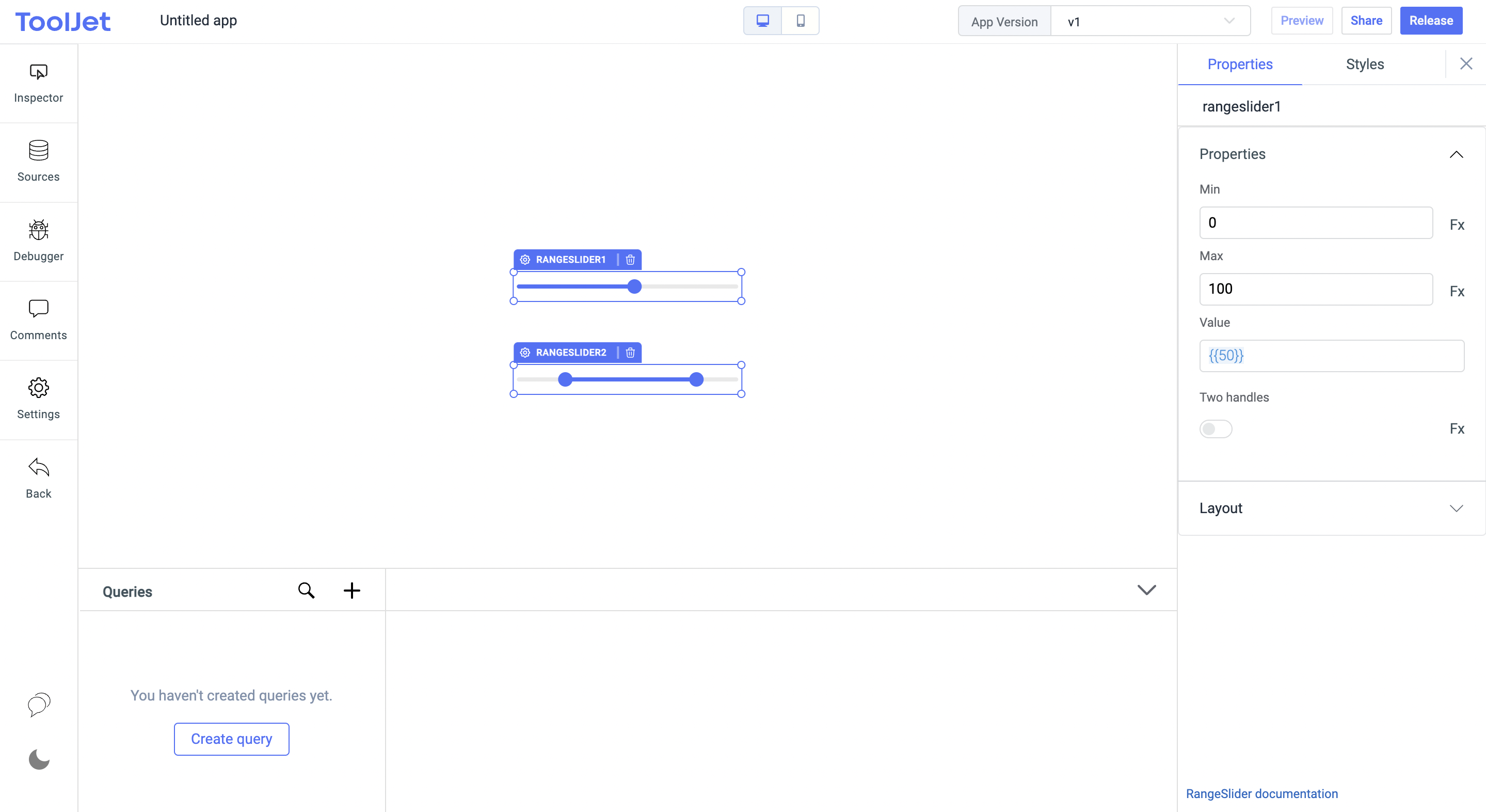
Range Slider
Range sliders are widely used across different UIs. One of the main purposes is to filter, explore all the related content and available in the control and settings options.
Range Sliders have "Two handles" option which allows user to select within a range.

Properties
Minimum value
Set the minimum value for the slider. This field accepts any numerical value.
Maximum value
Set the maximum value for the slider. This field accepts any numerical value.
Value
Set the default value when the widget loads. This can be used to pre-fill the value based on your data and requirements.
Two handles
The slider will now have 2 dragging handles. It is used to define a range of values versus a single given value.
General
Tooltip
A Tooltip is often used to specify extra information about something when the user hovers the mouse pointer over the widget.
Under the General accordion, you can set the value in the string format. Now hovering over the widget will display the string as the tooltip.

Layout
Show on desktop
Toggle on or off to display the widget in desktop view. You can programmatically determine the value by clicking on Fx to set the value {{true}} or {{false}}.
Show on mobile
Toggle on or off to display the widget in mobile view. You can programmatically determine the value by clicking on Fx to set the value {{true}} or {{false}}.
Styles
Line color
Enter the hexcode to set the default color for slider's track.
Handle color
Enter the hexcode to set the color for slider's handler.
Track color
Enter the hexcode to set the color for slider's active portion on the track.
Visibility
Set the visivlity of the slider programmatically. The default value is {{true}}.
Any property having Fx button next to its field can be programmatically configured.