Dropdown
The Dropdown widget can be used to collect user input from a list of options.
How To Use Dropdown Widget
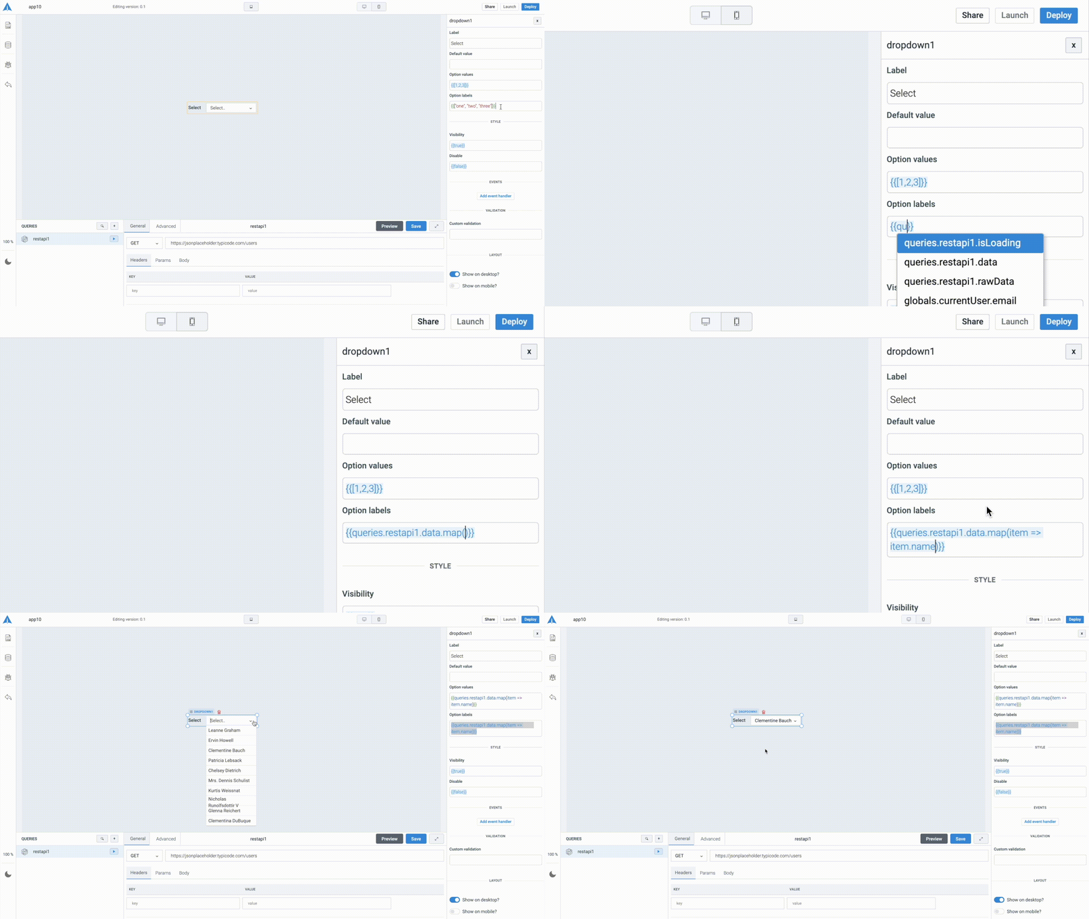
Dropdown options can be referred to your query data with dynamic variables.
Events
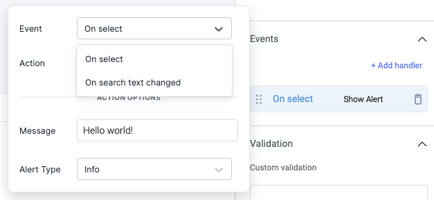
Event: On select
On select event is triggered when an option is selected.
Event: On search text changed
This event is triggered whenever the user searches through the options by typing on the dropdown's input box. The corresponding search text will be exposed as searchText.
Properties
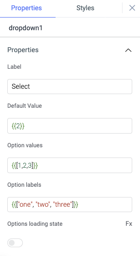
Label
The text is to be used as the label of the dropdown.
Default value
Value of the default option
Option value
Option values are values for different options in the list of the dropdown. Refer your query data with dynamic variables {{queries.datasource.data.map(item => item.value)}} or populate it with sample values {{[1,2,3]}}
Option labels
Option labels are labels for different options in the list of the dropdown. Refer your query data with dynamic variables {{queries.datasource.data.map(item => item.label)}} or populate it with sample values {{["one", "two", "three"]}}
Options loading state
Show a loading state in the widget using this property. It is off by default, toggle on to enable it. You can also programmatically set the values {{true}} or {{false}} by clicking on the Fx button.
Validation
Custom validation
Add a validation for the options in dropdown widget using the ternary operator.
General
Tooltip
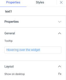
A Tooltip is often used to specify extra information about something when the user hovers the mouse pointer over the widget.
Under the General accordion, you can set the value in the string format. Now hovering over the widget will display the string as the tooltip.
Layout
Show on desktop
Toggle on or off to display the widget in desktop view. You can programmatically determine the value by clicking on Fx to set the value {{true}} or {{false}}.
Show on mobile
Toggle on or off to display the widget in mobile view. You can programmatically determine the value by clicking on Fx to set the value {{true}} or {{false}}.
Styles
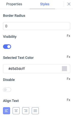
Border Radius
Use this property to modify the border radius of the dropdown. The field expects only numerical value from 1 to 100, default is 0.
Visibility
This is to control the visibility of the widget. If {{false}} the widget will not visible after the app is deployed. It can only have boolean values i.e. either {{true}} or {{false}}. By default, it's set to {{true}}.
Selected text color
Change the text color of the selected option in the widget by providing the HEX color code or choosing the color from color picker.
Disable
This property only accepts boolean values. If set to {{true}}, the widget will be locked and becomes non-functional. By default, its value is set to {{false}}.
Align text
You can align the text inside the widget in following ways: left, right, center, justified
Any property having Fx button next to its field can be programmatically configured.